Get Started with Standards
PROCESS HIGHLIGHTS
Challenge
Opportunity
Timeline
Aug 2024 - May 2025
Disciplines
User Experience Research
User Interface Design
Team
Nate Bennett
Feier Su
Maya Sundaresan
Camille Zuidema
Tools
Figma
Figma Jam
Google Docs
The Process
1
2
3
4
Discover
Identify Problem
Discover
Research Phase
Observational Studies
Participants (n = 8) completed tasks using the existing portal while we observed their navigation strategies, decision-making, and pain points.
Usability Tests
We tested the existing portal,gather feedback on layout clarity, labeling, navigation, and new content.
Key Insights
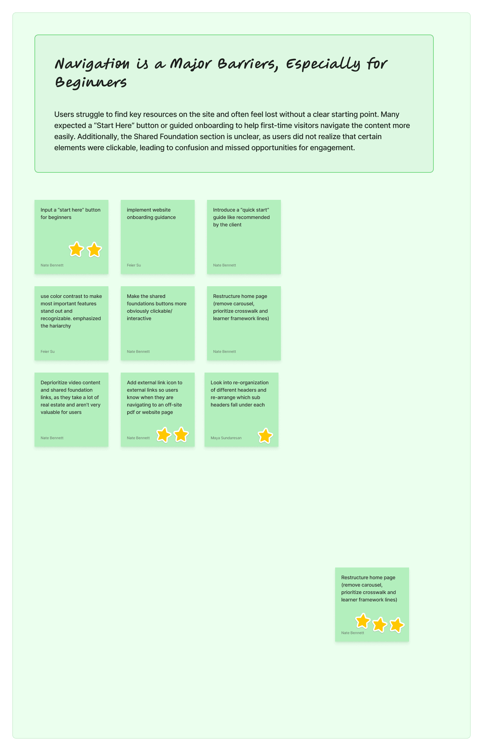
Navigation Barriers for Beginners
“Brand new librarians would expect the full standards to be on the site. It’s frustrating when most links on the site are to paid content” - K-12 Librarian
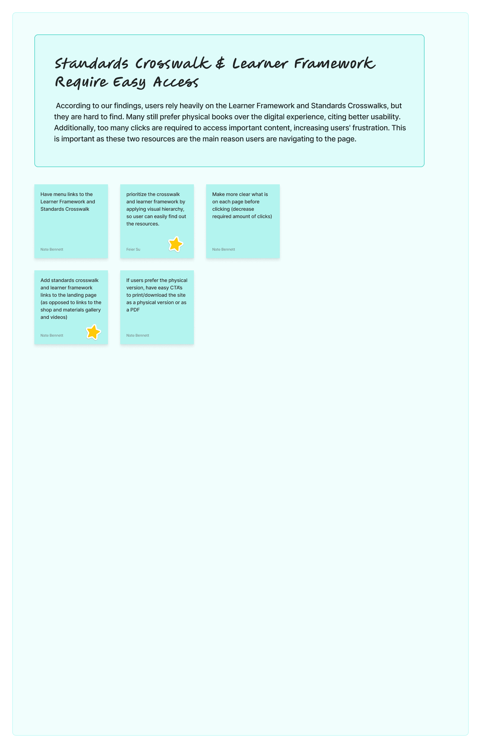
Difficult Access to Standards & Framework
“I prefer physical materials over the Standards portal to find certain resources because they are easy to navigate than the site” - Elementary School Librarian
Unclear Advocacy & Standards Positioning
“The Common Beliefs, Vision, and Mission should be more visible — they remind us why the standards matter and would encourage wider adoption.” - AASL Admin
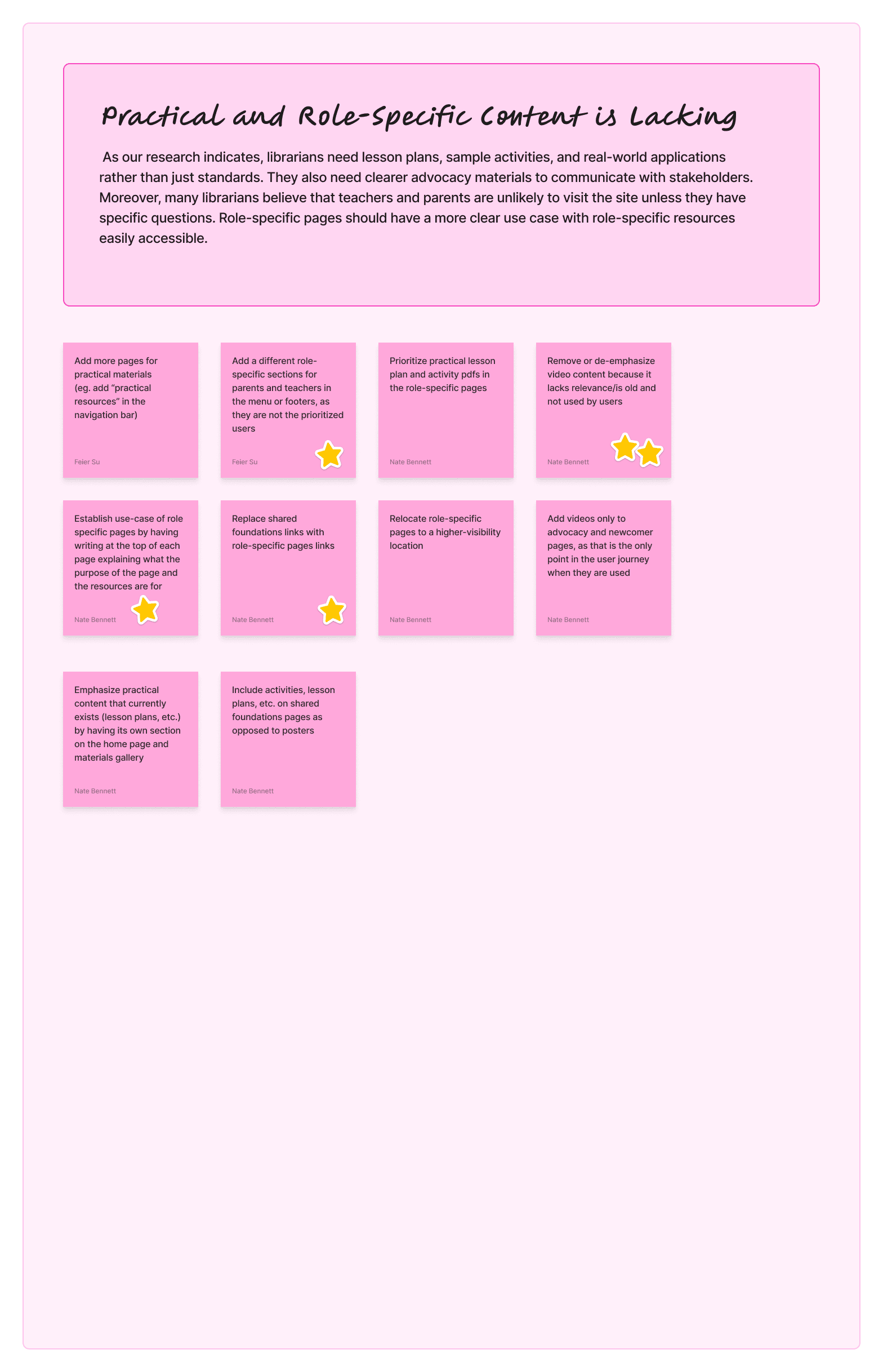
Lack of Role-Specific, Practical Content
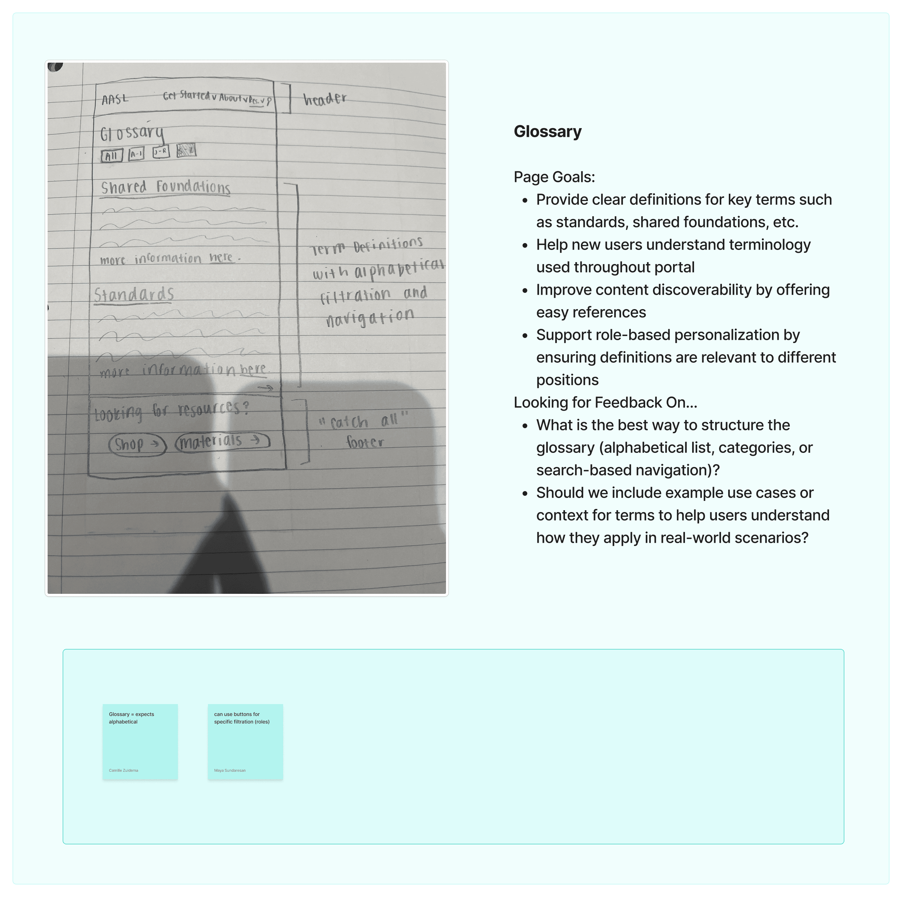
“It would be helpful to have resources more clearly labelled for specific roles to make it easier to quickly find what I am looking for” - University Librarian
Turning these key user pain points into targeted Design Artifacts


IDEATION
Brainstorm Session


Mid-Fidelity

FINAL DESIGN
Design System

FINAL DESIGN
Making it Great


Homepage - Before

Homepage - After


Shared Foundation - Before
Download” button led to a new tab with a PDF, requiring extra clicks.
Users expected instant download, causing confusion.
To view the next foundation, users had to navigate back manually, breaking flow.

Shared Foundation - After
Summarized content for each foundation shown directly on the page
Pop up window for pdf preview→ view materials without leaving the page
Links to related resources for seamless navigation

Navigation Bar - Before
Role-specific pages hidden under Home, making them hard to find
About and Resources menus were unstructured and unclear


Navigation bar - After
Improves onboarding with a clear Get Started path
Deprioritizes minor tasks (Shop moved under Resources)
Reduces clutter through streamlined menus
Why?


Why?
FINAL DESIGN
Final Prototype
EVALUATION
Impact
Statistics

navigation efficiency
User satisfaction
EVALUATION
Reflection & Next Step
IF I had more time, We would definitely…